The brand refresh for Meredith Dairy was yet another project undertaken at The Hive Design in Footscray. Meredith Dairy had several logo version, which were all slightly different in kerning and size and shape. The new re-freshed logo now has the classic Meredith Dairy look, but is now soundly typographically constructed, and aesthetically pleasing on the eye.
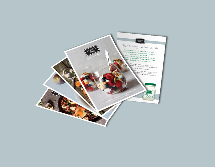
Other print materials were also over hauled and the new, fresh look applied to promotional materials and other communications such as stationery.
Client
The Hive Design (Meredith Dairy)
Project
Brand Refresh and print materials
Services
Typography, brand refresh, brand roll out and application